
 So last spring, I found myself with some down time in between projects. I knew I had 2&2 at FringeNYC coming up, so I figured I'd put my feelers out to my colorist contacts for some uncredited flatting assistance. None of them had any immediate projects, but they said they'd pass the word.
Almost immediately, I got a call from Ethen Beavers, the illustrator for a three book young girl novel series, the Ultra Violets. Book number one had just come out and he needed a replacement colorist for books two and three. Would I be interested? 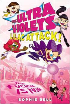 He went on to explain that the characters were designed by Chris Battle, the creator of the Power Puff Girls. Since book one had already been done, I would need to hit the ground running to match the look and feel of the existing style, but would still be able to make it my own. The artwork would be rendered in greyscale and printed with purple ink for a pseudo colored appearance. That was all the better as far as I was concerned. Greyscale limits the color palette. Instead of millions with which to work, I in effect had 100. It is always a welcome challenge to create effective contrast between very similar tones. Click on either arrow
to manually advance slide show. Work on my first book (the second in the series) commenced in the spring and there would be a hiatus over the summer and by early fall, the final book would be ready for me. Perfect timing. The books straddled my Fringe Festival commitments.
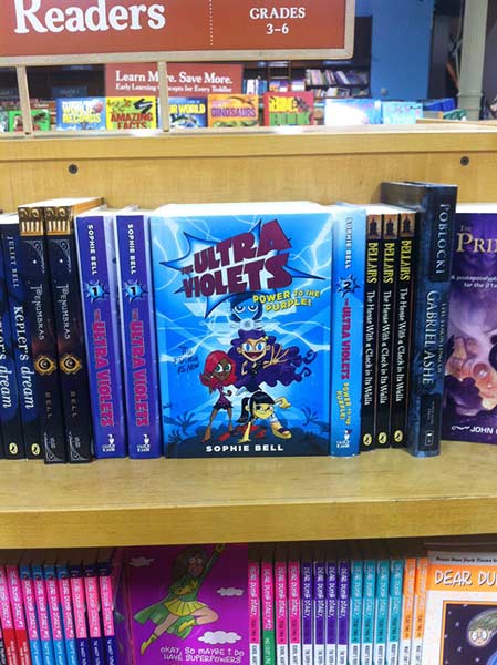 Not too many people can say that they had an Off-Broadway show and a published book appear in New York at the same time. I am very happy to be one of them. |